PROJECT OVERVIEW
The Problem
The goal of an email campaign is to generate leads and ultimately revenue. However, this can’t happen unless emails actually reached the inbox. By sending to addresses with typos or to invalid users, a company’s reputation becomes damaged and ISPs like Gmail could block them. SparkPost’s Recipient Validation is a service that checks the validity of email addresses and returns a clean list to send with.
My Role
Lead UX Designer (research, wireframing, visual design, prototyping, user testing)
RESEARCH AND DISCOVERY
Competitive Analysis
There is no shortage of validation services out there, so why would a customer choose SparkPost over the others? My research revealed that users cared more about cost than anything else. They cared about quality, but even a 50% improvement in deliverability at a low cost goes a long way for them.
Personas
Poor sender reputation was a known issue in the email delivery space. However, users who were responsible for customer lists and new user sign ups were ultimately on the line when things go wrong. Therefore, they were typically the ones who required and used validation services.
My Approach
User and Client Needs
First and foremost, users needed a functional product, and they assumed that’s what they’re getting when they chose that service. In addition, they wanted actionable results that they could trust. The service isn’t free and they need to know they were getting their money’s worth.
The goal for SparkPost was to expand its service offerings to generate more revenue. They also wanted to establish themselves as the one-stop-shop for all things email.
User Flows
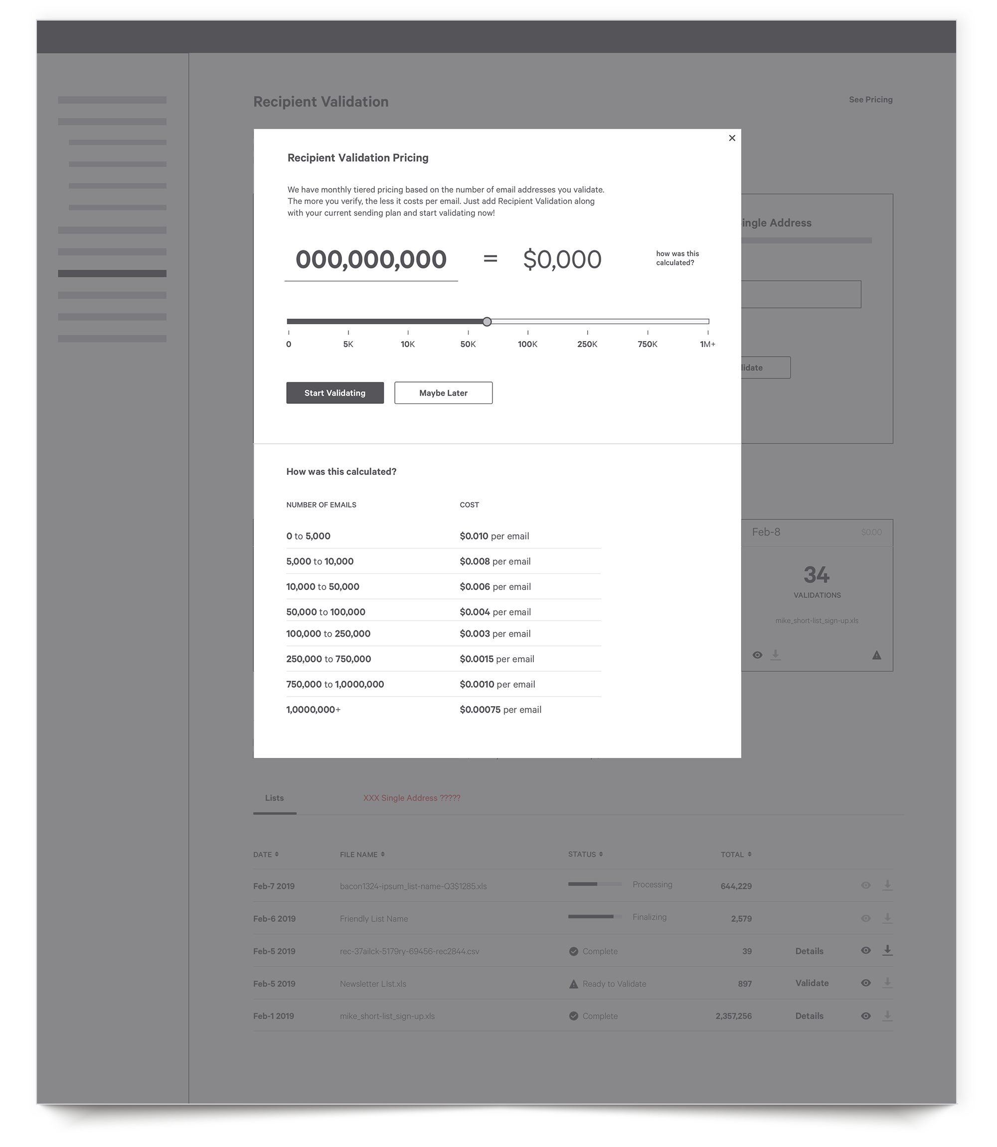
As I mapped out user flows, it became clear that having a connection to the billing section was key. Since users valued a low cost over everything else, they needed to be able to refer back to their monthly usage and the tiered pricing structure.
Wireframes
I mocked up wireframes using the insights learned from my research. After reviewing the layouts internally with the UX and front-end teams, I conducted some initial user testing.
User Testing
Overall, the wireframes were headed in the right direction, but some modifications had to be made due to technical and time restrictions as well as user comments.
Visual Design
Prototypes
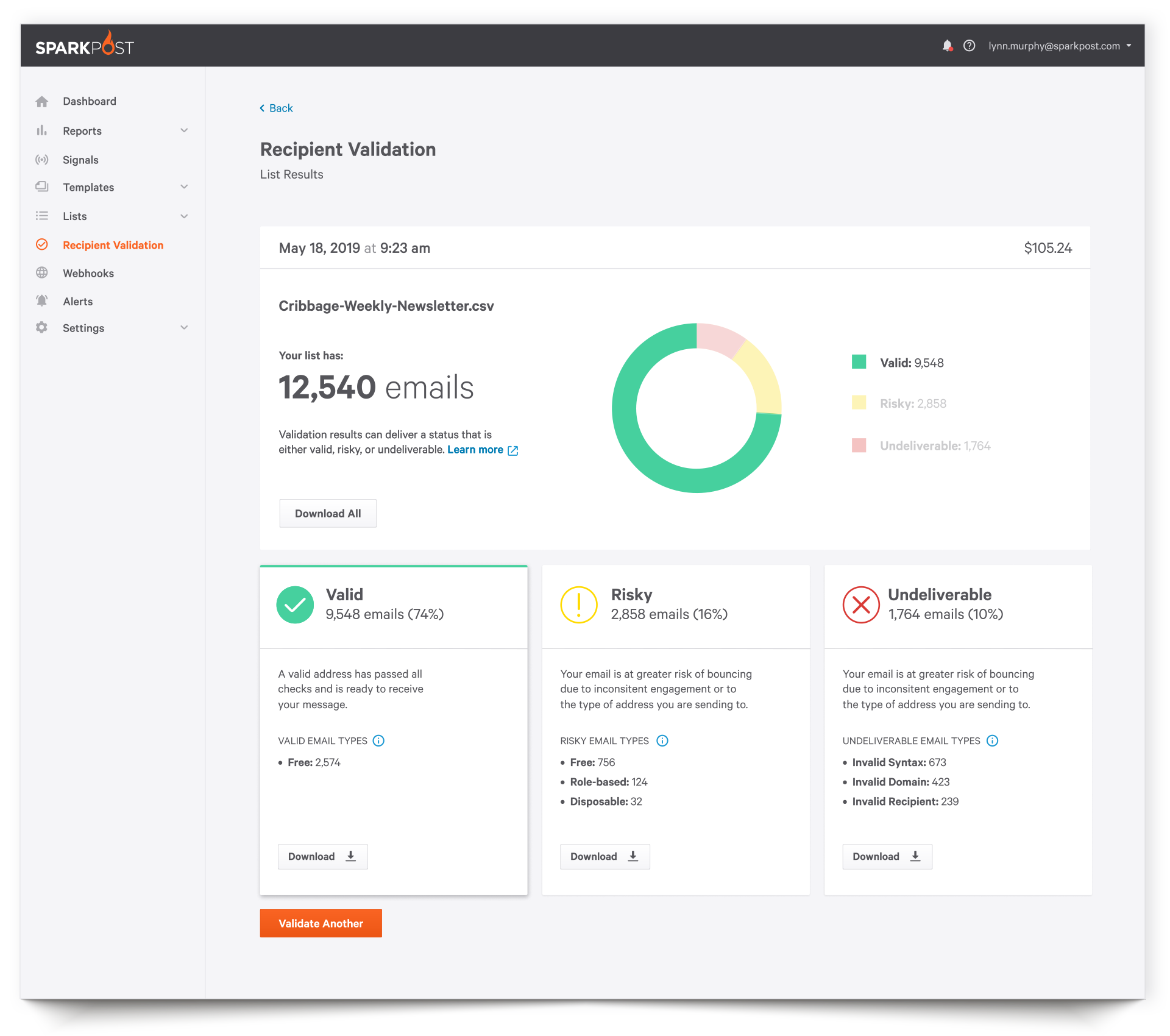
I applied the feedback learned to my visual design solution and created a working prototype. For the results page, I wanted to make sure that I created a future-proof solution and didn’t box SparkPost into a tight layout that wasn’t flexible. For the moment, there were only three category types for results. However, if additional categories were added, I wanted to make sure a solution existed that could accommodate. Therefore, I used a ‘row’ solution for displaying the list categories.
Responsive Behavior
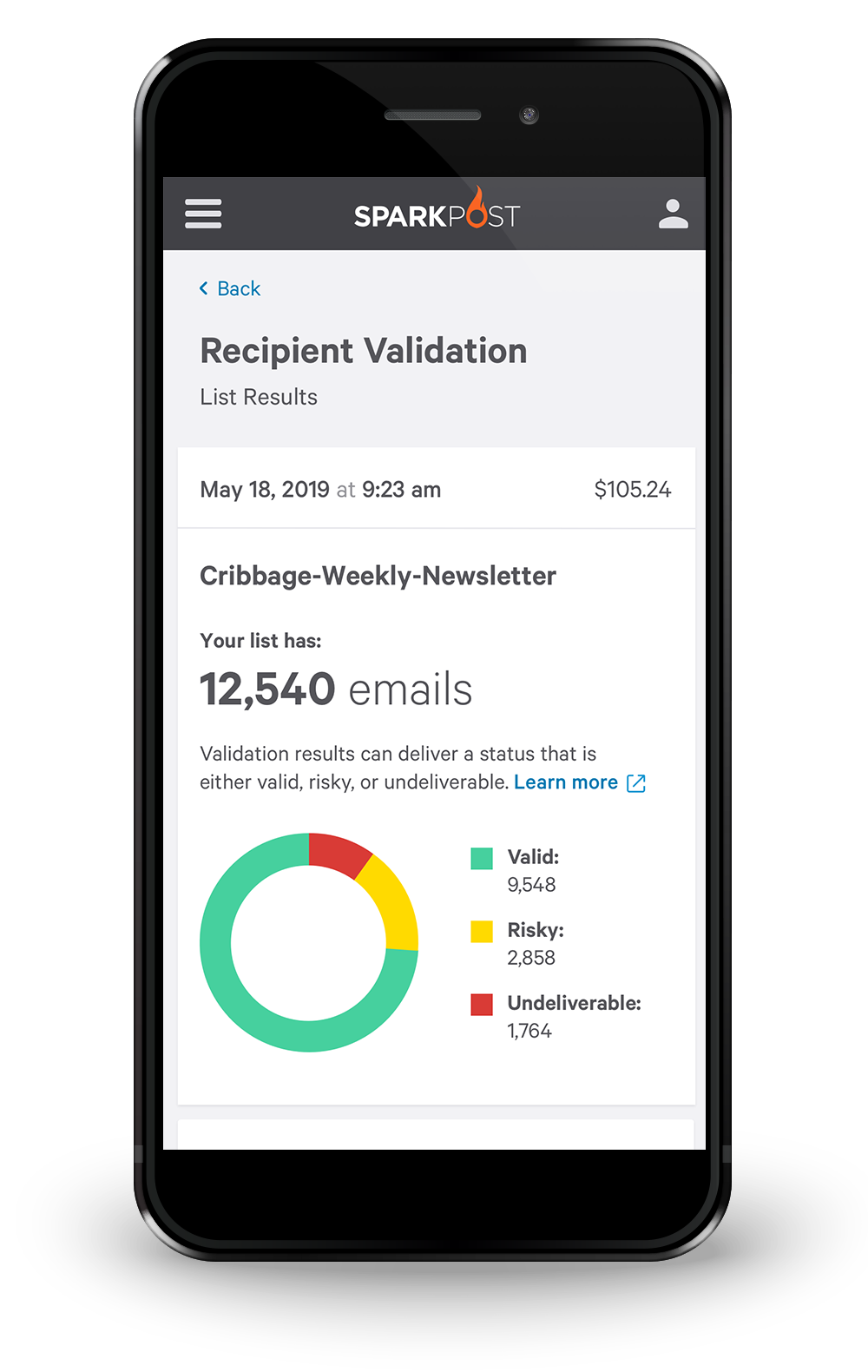
Users don’t upload and validate lists on mobile devices because TXT and CSV files aren’t stored on phones. Data usage would be astronomical, and battery power would drain in very little time.
That said, users may want to validate a single address or refer to the API integration instructions. Users may also want to review their list upload results from their phones, but options for downloading results are disabled for the reasons listed above.
Feedback and Iterations
Users responded well but had some feedback for the results page. They wanted to see the categories together without having to scroll through a list. I created a card solution as an alternative, which users greatly preferred. If additional breakdowns were needed at a later time, the row layout could be revisited.
When Recipient Validation was released, SparkPost received a lot of positive feedback, and use of the tool doubled. With more companies in the space releasing their own validation tools, SparkPost was in a better position to remain competitive and stay ahead of the curve.


