PROJECT OVERVIEW
The Problem
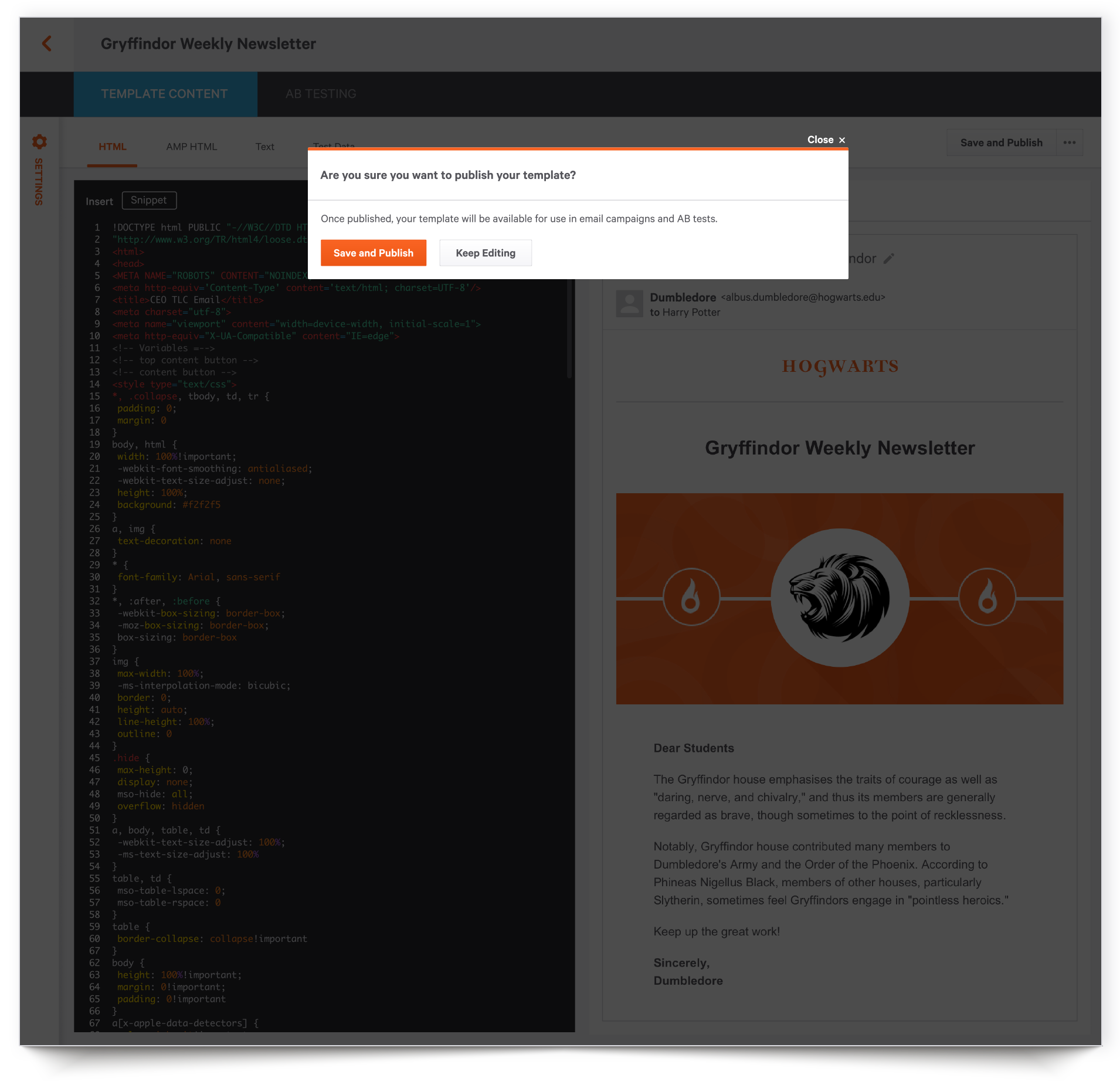
Users of SparkPost, an email delivery service, were requesting a WYSIWYG editor to create email templates. After speaking with customers it was clear that what they needed was to edit code while previewing changes. They didn’t need a template creation tool, but instead a side-by-side code editor.
At the same time, SparkPost was getting ready to launch new features that analyzed email performance and engagement. The existing AB testing tool could be a great resource to provide additional data, but it also needed some improvements. Because AB testing is connected directly to email templates, the two roadmap items were merged.
My Role
Lead UX Designer (research, wireframing, visual design, prototyping, user testing)
RESEARCH AND DISCOVERY
Competitive Analysis
I looked at SparkPost’s main competitors as well as services with email templates like Marketo. It was clear that other companies had significantly more robust templating capabilities. What stood out most was how visual the experiences were. You could edit code and see your changes side-by-side. Users could preview templates and take simple actions like duplicate or delete without having to open each individual template.
Personas
SparkPost was adding new analytics features, and the target audience was growing from being mostly developers to users who created email content and tested its performance. Those personas fell under marketing and sales ops as well as SparkPost’s own customer success managers who oversaw the accounts of the larger enterprise customers.
My Approach
User and Client Needs
Using Realtime Board, I organized user and client needs into categories, with yellow for users and blue for clients.
While trust and actionability were important, users needed a service with greater functionality that was built around their preferred workflow. SparkPost’s needs fell primarily under growing the business and driving revenue.
User Flows
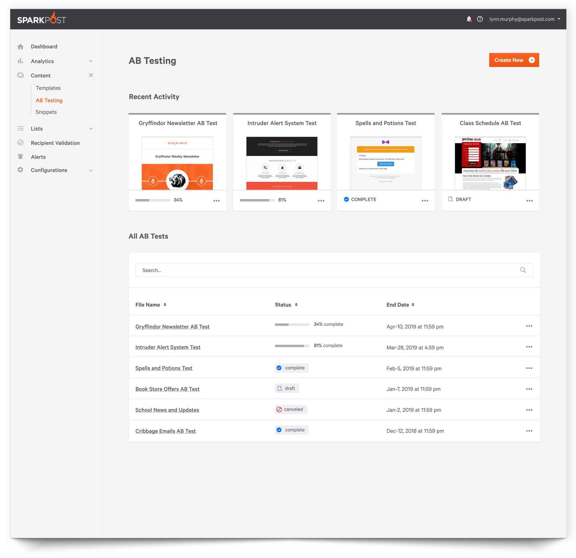
In looking at user flows, it became clear that there needed to be a tight connection between snippets, templates, and AB Testing. The decision was made to merge them into one section, as they were currently separated in the navigation.
There was also confusion around having published and draft versions of a single template. Versioning would solve this, but that required back-end work that the roadmap didn’t allow for. So, I had to find a front-end solution.
Wireframes
Based on my user research, I mocked up wireframes and reviewed them internally with the UX and front-end engineering teams. I then conducted user testing with customers to get their feedback.
User Feedback
Overall, the wireframes were headed in the right direction, but some modifications had to be made due to technical and time restrictions as well as user comments.
Visual Design
Prototypes
Incorporating both internal and user feedback from the wireframes, I created an initial visual design prototype. The SparkPost app had an existing component library in place, so those styles were used as a start. To account for the complex options and view requirements for this new type of page layout, I created a few new header and navigation styles to expand the existing system.
Feedback and Revisions
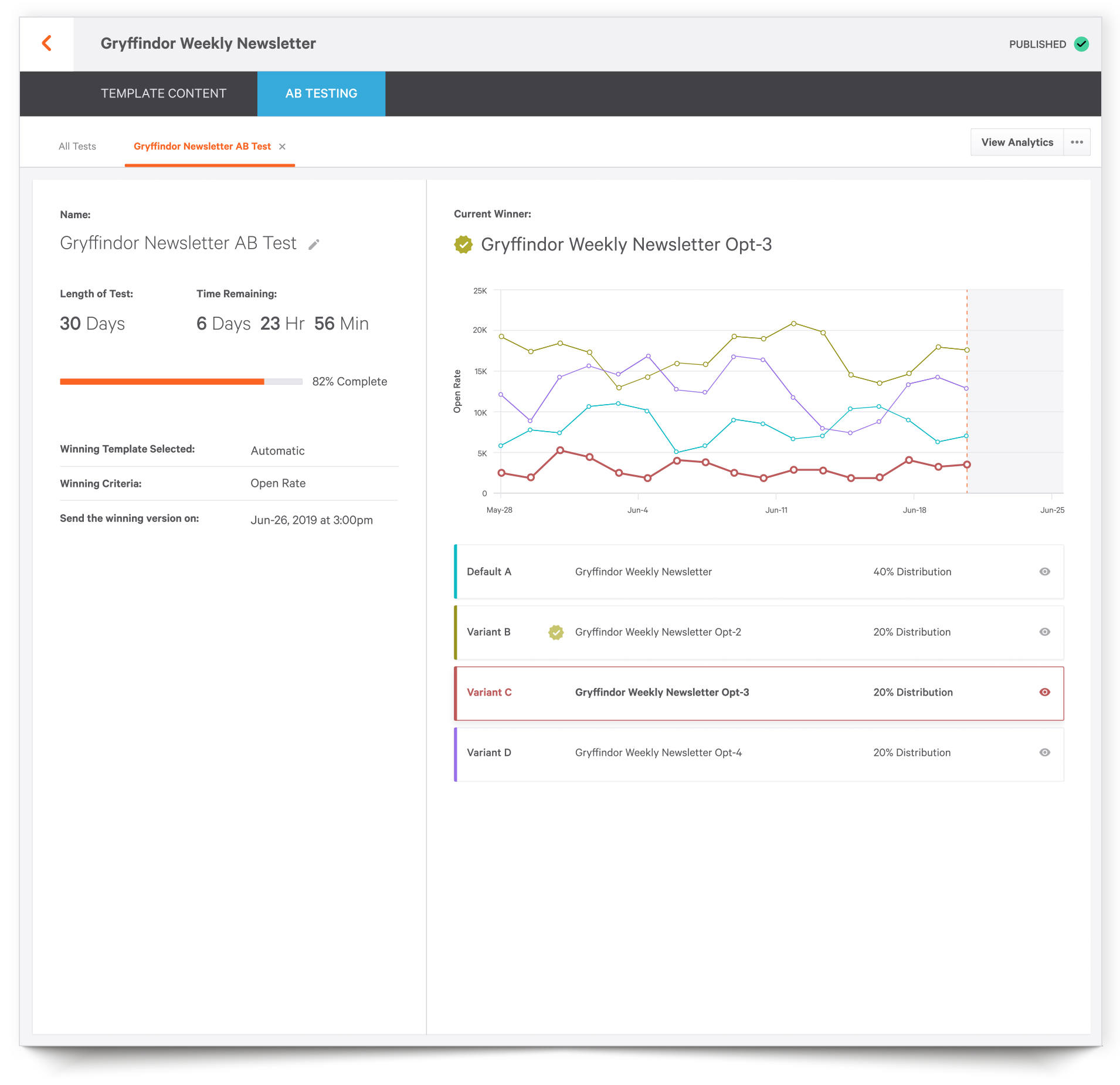
Feedback was positive on all layouts except for the AB Results Page. Users were confused as to why the chart and stats were so huge. They appreciated the interactivity, but the scale overwhelmed them in comparison to the rest of the app.
I made some adjustments to balance better with the rest of the product.
Responsive Behavior
The SparkPost app was primarily viewed on desktop as most customers accessed it as part of their work day. Templates in particular was rarely accessed via mobile device, especially with features like a code editor. Historically, mobile behavior was rarely considered as necessary.
That said, I felt it was important to poll customers and ask what devices they used and if they ever felt it necessary to access SparkPost on a smartphone. Users said no, they never had. However, I probed a little deeper. It’s possible they hadn’t before because the app wasn’t mobile friendly. So I asked if the scenario ever came up where there was a typo in an email and they needed to quickly fix it, perhaps while commuting or during lunch. Customers then said yes, that actually happened. Therefore, I created mobile prototypes and worked with the front-end team to find the best responsive solutions.
efficient workflows that generate revenue
After creating the visual solution, the product team was able to launch the Template Editor to the general public where it received positive feedback. Users were able to eliminate their current code editing tool from the long list of products they used daily and greatly appreciated a more streamlined workflow. Saving time and consolidating tools helped SparkPost’s customers to reduce costs and generate more revenue.


