PROJECT OVERVIEW
The Problem:
SparkPost was targeting a broader user base who needed more pricing tiers and feature add-ons for their email delivery service. While the goal was to help drive growth, sections in the app for billing and plans weren’t built to handle complex options and choices. If the app wasn’t able to let users change plans and features, then growth could not be achieved.
My Role:
Lead UX Designer (research, wireframing, visual design, prototyping, user testing).
Research and Discovery
Competitors:
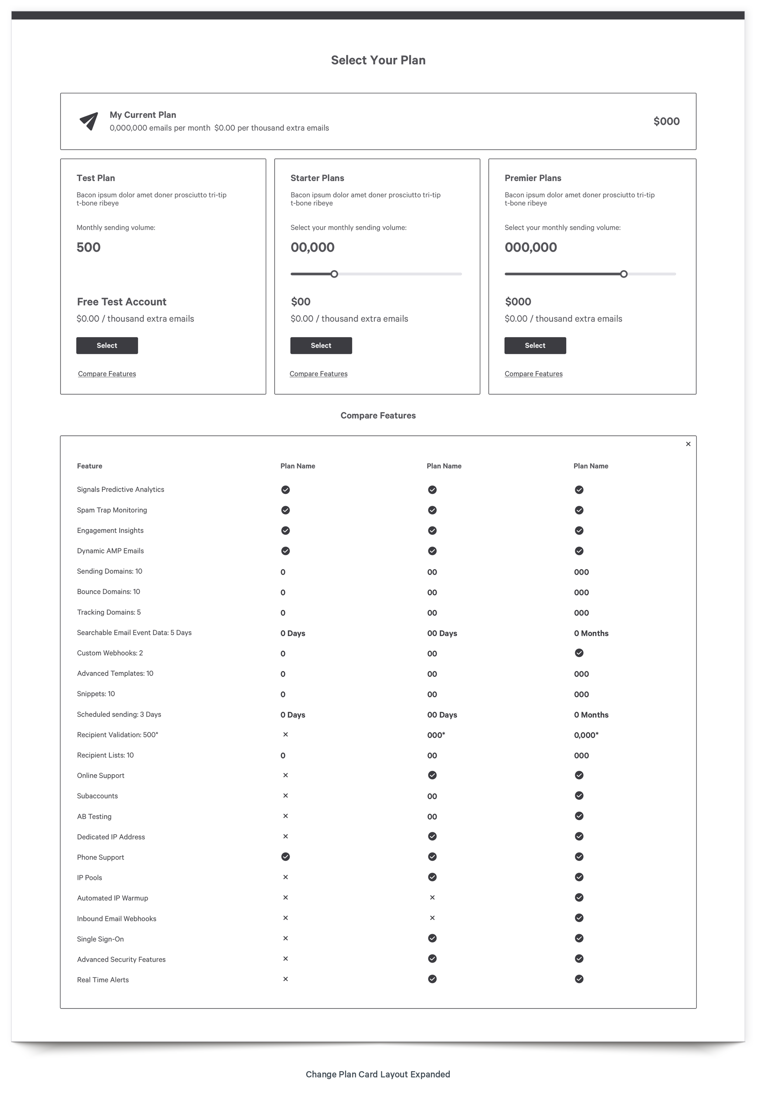
I looked at how other companies handled complex plans, pricing tiers, and specific features associated with each category. Our main competitors handled pricing in one of two ways: by using cards with a feature comparison grid, or by using an accordion-style list. Both were viable options that I explored in the wireframe stage.
Personas:
All user types regularly access their account settings where they view plans and billing. Therefore, this solution had to appeal to all of SparkPost’s personas.
User Flows:
As I began to map out user flows, it was daunting just how many features a user may have to modify in order to change their plan.
Wireframes
Plans and Tiers
There were two main functions that I needed to solve. First, I had show plans and pricing tiers in a way that didn’t confuse the user. Second, I had to walk a user through the steps of downgrading their service when their new plan offered fewer features than what they were currently using.
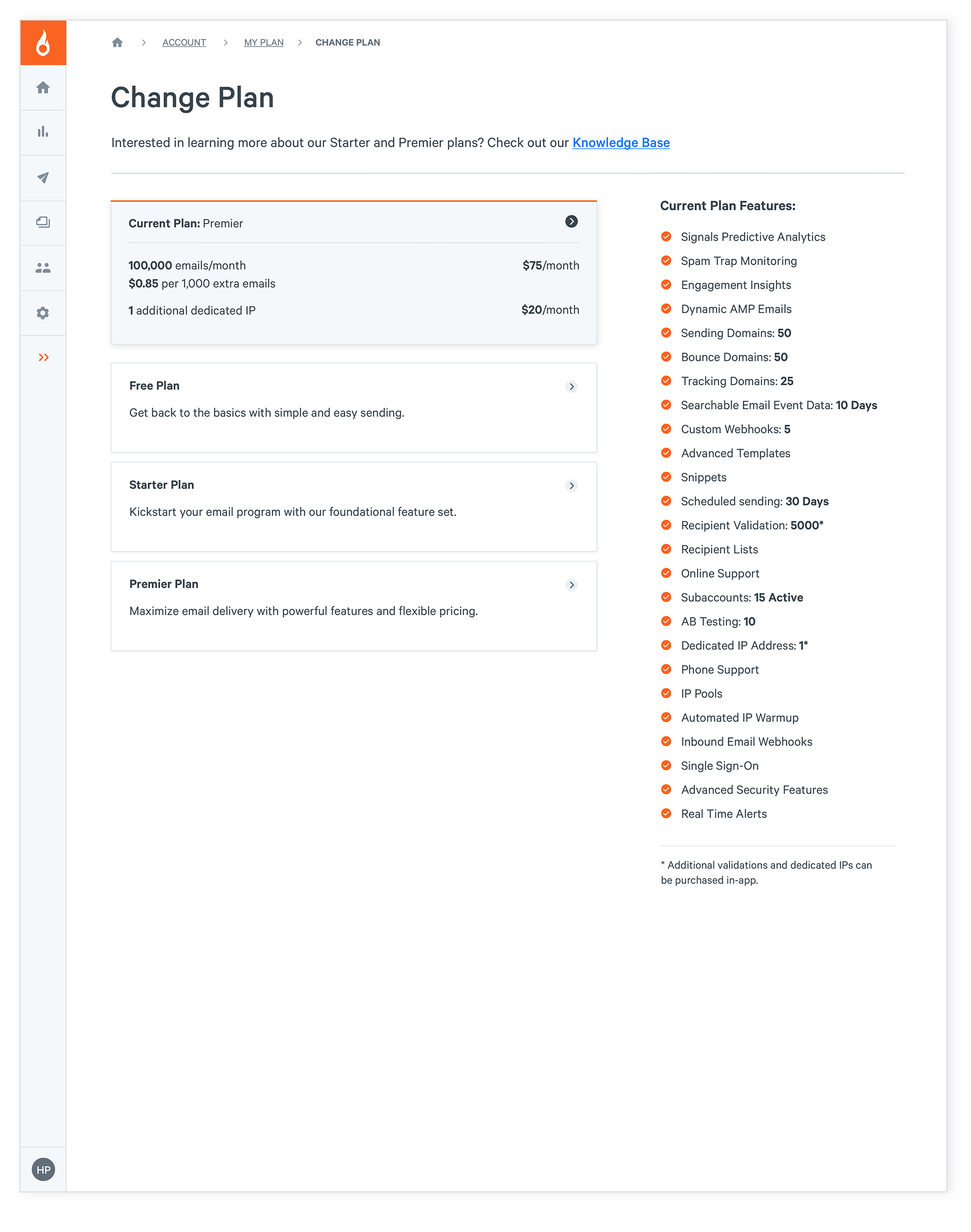
For showing plans, I create two layout styles and wireframed a few options for each. I tested both a card approach as well as a list/accordion design.
Downgrade Flow
The downgrading process was more complicated. I could either send a user away from the flow to manage features in the app and have them return after each one to complete the plan change process. However, there were too many ways this could go wrong, and it was making things overly complicated. A wizard approach would allow users to stay in one place and have the features brought to them instead of them running all over the app and possibly losing progress made so far.
When tested, users preferred being taken through the steps using a wizard. They wanted to walk through the process in a linear fashion and preferred the one-column view.
Visual Design
Prototypes
I created visual designs for both the card and the accordion approach. When tested, users all preferred the accordion approach. They liked seeing the features listed out with a clear visual change as to what was checked or not when you moved between plans.
The feature grid was good in theory, but in practice, it taxed users a bit more to sift through all of the options. They wanted to see just one at a time. With the linear approach applied, the downgrade wizard tested very well.
Next Steps
This was initially scoped as a quick update with minimal front-end time needed. However, my UX research revealed that it was a more complex task than simply ‘adding a button’. The existing page was created when the company didn’t know they would be adding such complexity to a simple plan change process. There was no way to easily add the necessary functionality when the page and the process needed a complete overhaul.
Fortunately, the UX team had already started on a major app redesign. They were able to apply these changes using the new app structure and styles. With the barriers removed and timeline adjusted, the proper solution could be created, allowing users to seamlessly change and adjust plans as needed.


