PROJECT OVERVIEW
The Problem
SparkPost was heading in new business directions and was expanding their feature offerings. However, the app was originally built for one task: to be an email delivery service. The company came to realize they had simply outgrown their app. The main issues were as follows:
The current component library was limited, restricting options to create optimal user experiences in an efficient way. In addition, it needed to be updated with accessibility in mind.
SparkPost was built for desktop users, with mobile usage historically at around 6%. This was changing with the new company direction, but the app wasn’t optimized for mobile devices.
The maximum page width was small, and too much real-estate was being used by fixed elements like navigation. This was creating a cluttered page, adding to the user’s cognitive load.
The business was targeting a broader user base with more pricing tiers and feature add-ons. While the goal was to help drive growth, sections within the app, like billing and plans, weren’t built to handle complex options and choices. If the app wasn’t able to let users change plans and features, then growth could not be achieved.
My Role
UX Designer (research, wireframing, design system creation, visual design, prototyping, user testing).
The Process
Layout
The UX team did an audit of all page types in the app. The majority were either a list page, a create new page, or an edit existing page. Our team leader tasked us to independently redesign one of each page type for an existing section. We shared our designs with the team and began with those as a base for the redesign.
Next, a team member created wireframes of basic layout structures and we tested users on their preferred method of viewing content. Users preferred the Annotated Half Panel layout.
Color
We then turned to color, creating an expanded palette that was accessible, with special consideration for data visualization and color-blind users.
Design System
The team listed out all components and layouts needed to build a versatile and future-proof design system. We began to populate the winning layout wireframes with various UI design elements. The team worked together to take opinions and ideas and narrow them down into workable components.
Navigation
Information Architecture
The existing information architecture (IA) was not organized by how users grouped tasks but rather by which engineering team built which feature. We conducted a card-sorting exercise using Optimal Workshop and sent it to a group of 75 users. The results indicated the IA needed to be reorganized for how users work, not how internal teams were structured.
Format
In addition to substance, page real estate wasn’t being used efficiently. The navigation size and placement were fixed. Page layout wasn’t based on a responsive grid, so the maximum page area allocated to content was too small. UX solutions had to be passed up because they simply couldn’t fit in the space allowed.
The new navigation could be expanded and collapsed, and placement stayed on the left allowing sections to grow vertically if new labels are added. The maximum page width was wider, and an underlying grid system was applied for better responsive behavior.
Components in Action
Balance
It’s one thing to map out design system components as separate elements, but the key was to make sure they worked together functionally in actual page layouts. We tested the various components in a number of layout situations and made modifications along the way as needed.
Clarity and Simplicity
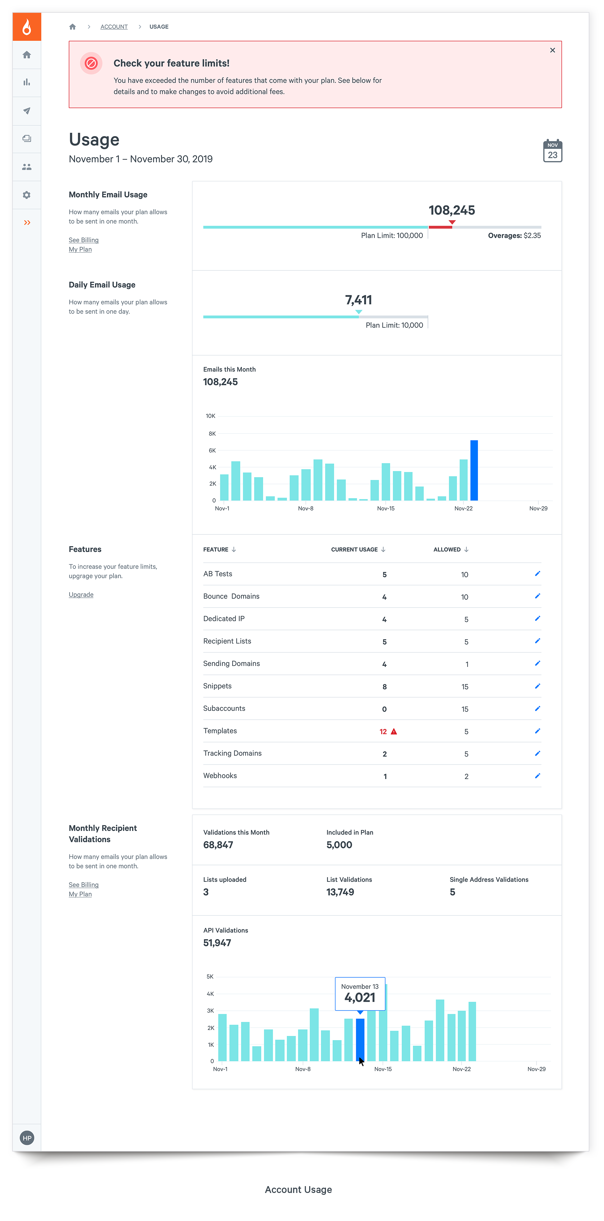
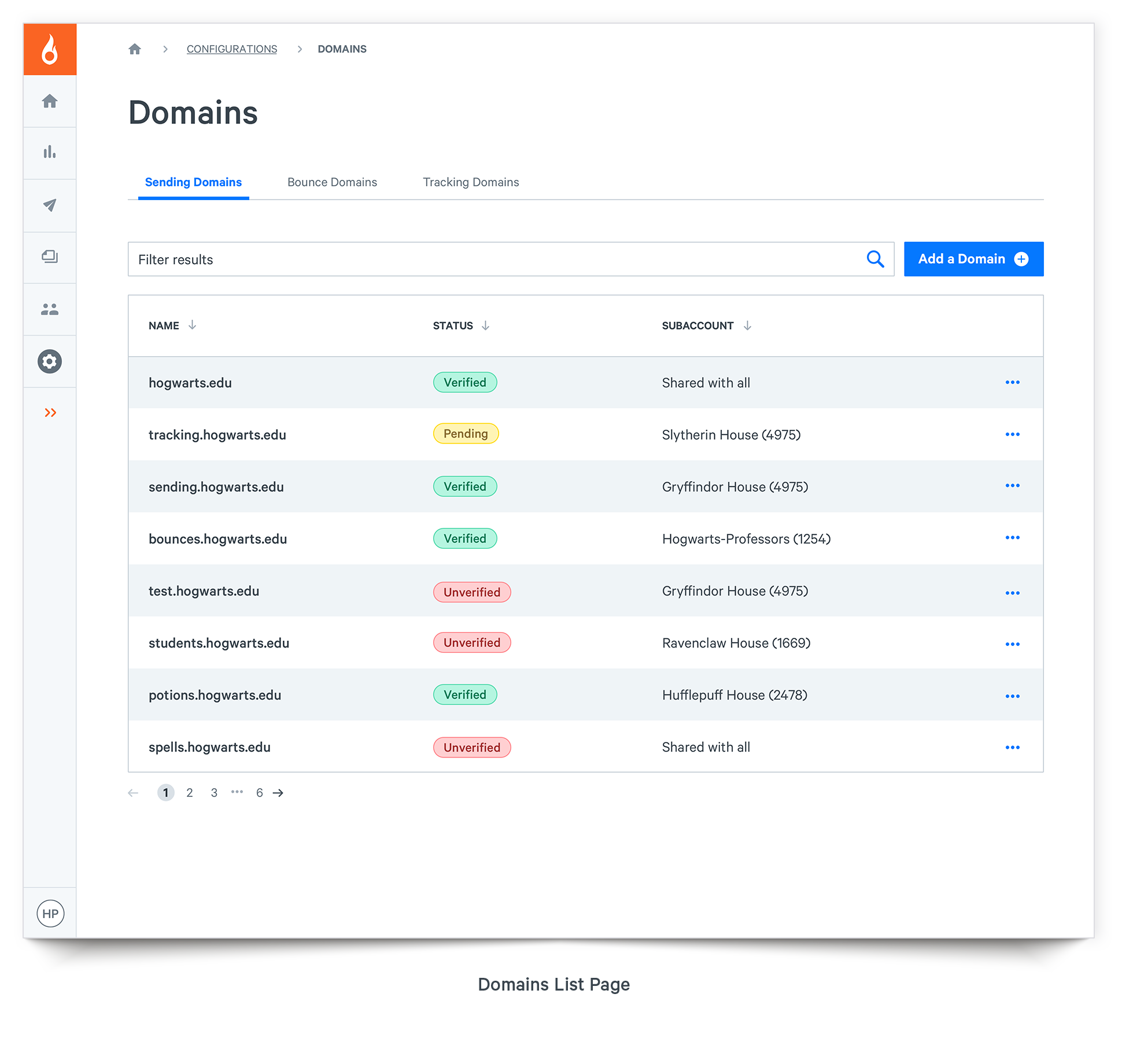
A key focus of the redesign was to remove distraction and clutter on the page. The goal was to help users focus on their content, allowing them to complete the task at hand. We refined list pages with cleaner and more minimal tables. We created consistent styles and locations for actions like ‘duplicate’ or ‘delete’ throughout. For edit existing pages, labels and instructional details were on the left, user content on the right, allowing users to find what they need at a glance instead of sifting through a bunch of details they already read.
Filtering Options
While SparkPost began as an email delivery service, the company was moving in a data and analytics direction. The existing app had limited filtering capabilities using a typeahead tool in a search field to narrow down results. The new UX solution used a drawer with tabs, allowing for advanced filtering options. Drawers were a common pattern for mobile devices as well, allowing users better access while checking the status of a campaign on the go.
A smarter product built for growth
With the redesign underway, SparkPost was positioned to have an impressive product that customers wanted to use. The new comprehensive and streamlined design system reduced both design and development time by as much as 50%. Adherence to accessibility best practices allowed individuals with disabilities to do their jobs without any barriers. Consistent UI patterns and behaviors conformed to tested mental models, creating a smart, reliable, and enjoyable experience for all users.


